Keyboard ALT + g to toggle grid overlay
Campaigns
Our audience is exposed to Autodesk through many different touchpoints and experiences. It is crucial that we present ourselves consistently across these touchpoints to appear as one Autodesk, build brand recognition, and establish trust with our audience. Campaigns are one of the key touchpoints where we have the opportunity to do so.
The following campaign design system helps us humanize our brand and present a unified Autodesk in a way that will scale to support the growth of our business.
Campaign framework
Each campaign touchpoint is the sum of many brand elements coming together to create an experience. We’ve categorized these elements into two buckets: fixed elements and flexible elements.
Fixed elements
These are elements that should be easily recognized across all touchpoints. Their presence is persistent, unchanging over time, and should be used consistently.
- Autodesk logo
- Product logos
- Color highlights
- Call to actions
- Typography
Flexible elements
These elements are designed specifically to be adaptable to meet the needs of different contexts and audiences. They are versatile in makeup, so that you can employ them in your designs in the way that works best for what you are trying to achieve.
- The edge
- Messaging
- Imagery
- Animations
Fixed elements
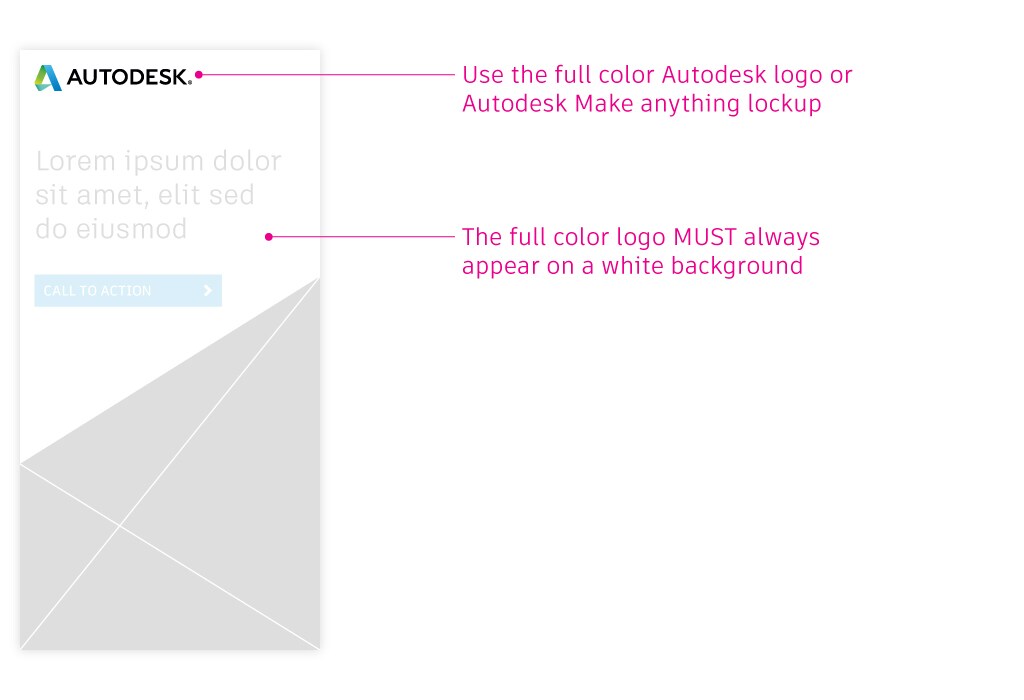
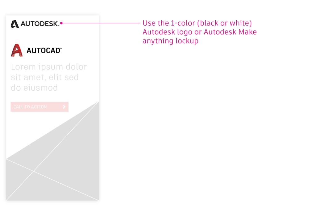
Autodesk logo
Prevent corporate and product colors from competing with one another by featuring the Autodesk logo in one of two ways within your campaign.
For a product-agnostic campaign
For a product-specific campaign
For additional information on the Autodesk logo such as clear space, placement, and usage, visit the Autodesk logo and tagline sections of the Brand Hub.
Product logos
Avoid repetitive instances of corporate and product names in your campaign to avoid clutter and appearing redundant. Use one of the following product logo system hierarchies when designing a touchpoint.
Product lockup + corporate logo
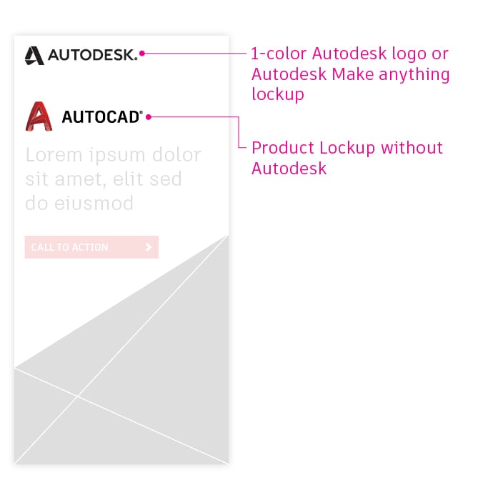
Product icon + product name + corporate logo
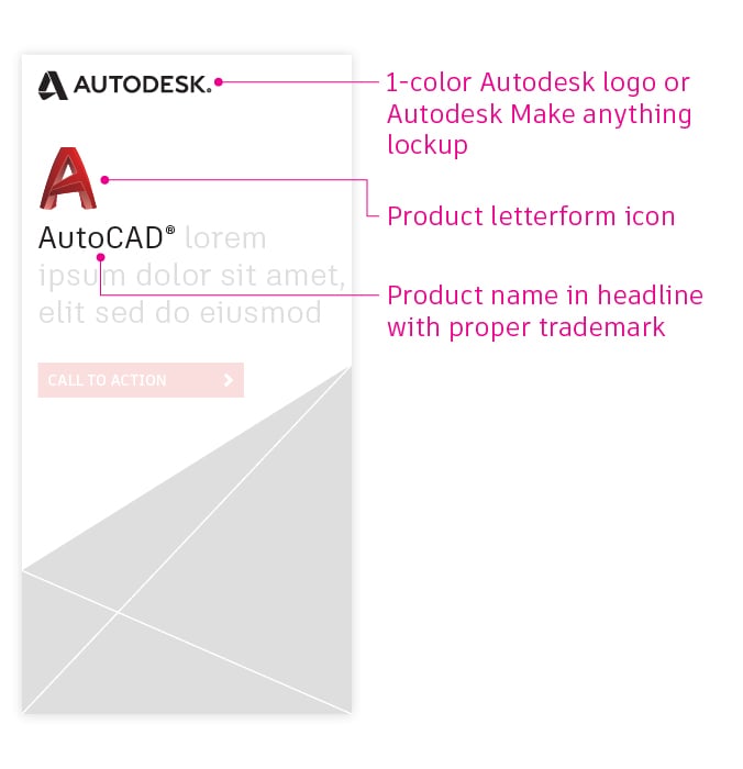
Full product lockup
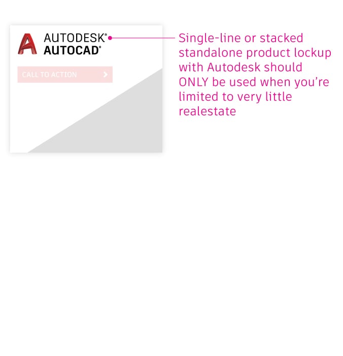
For additional information on the Autodesk logo system and product identities, visit the Logo system and Product identity sections of the Brand Hub.
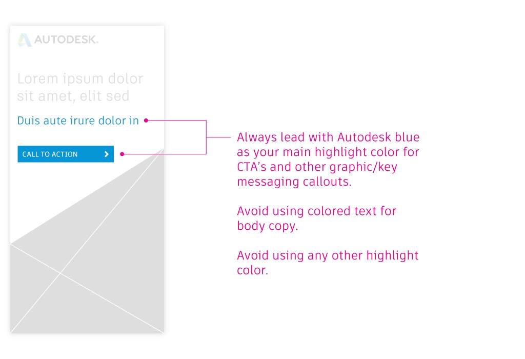
Color highlights
Color is a great way to draw attention to certain elements or add highlights to your campaign.
For a product-agnostic campaign
For a product-specific campaign
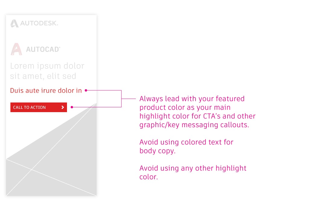
For additional information on color formulas and specifications, visit the Colors section of the Brand Hub.
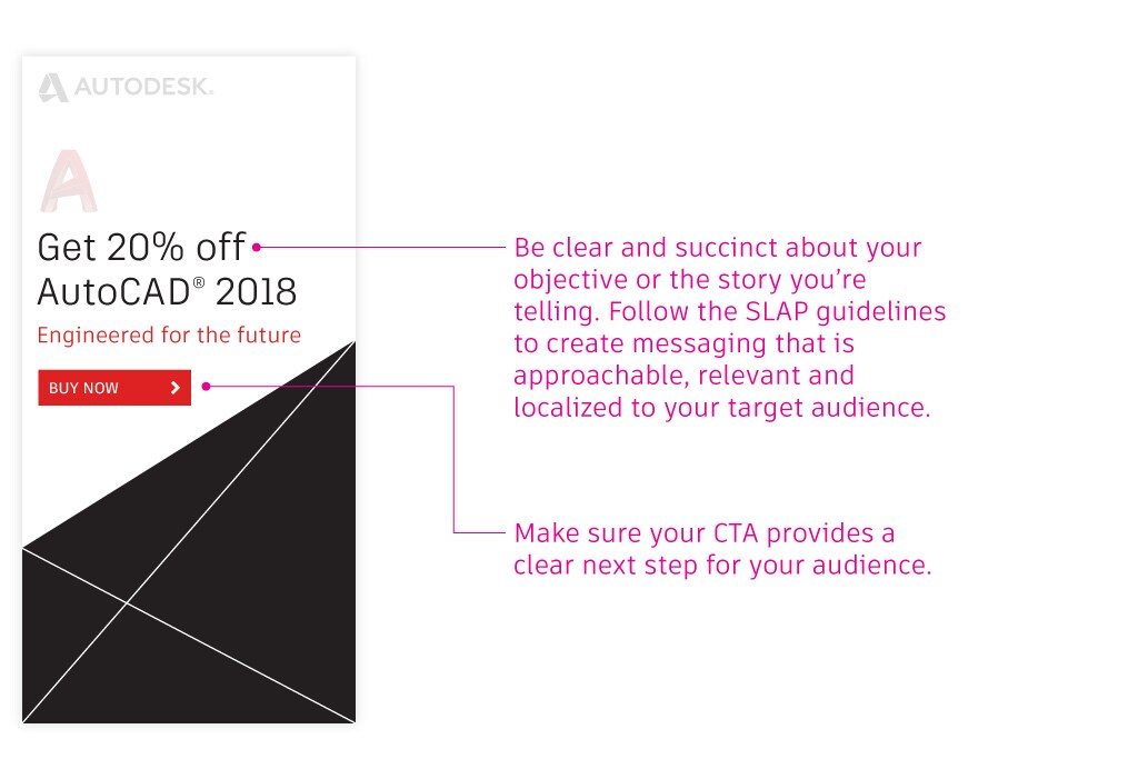
Call to actions
Different types of CTAs can be used in campaign touchpoints, depending on several factors including medium, layout dimensions, and objective. Regardless of these factors, ensure that your CTA is set in the proper highlight color depending on whether your campaign is product agnostic or product specific.
For screen
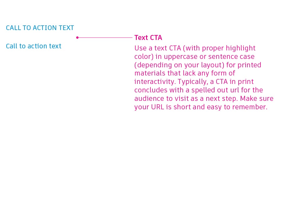
For print

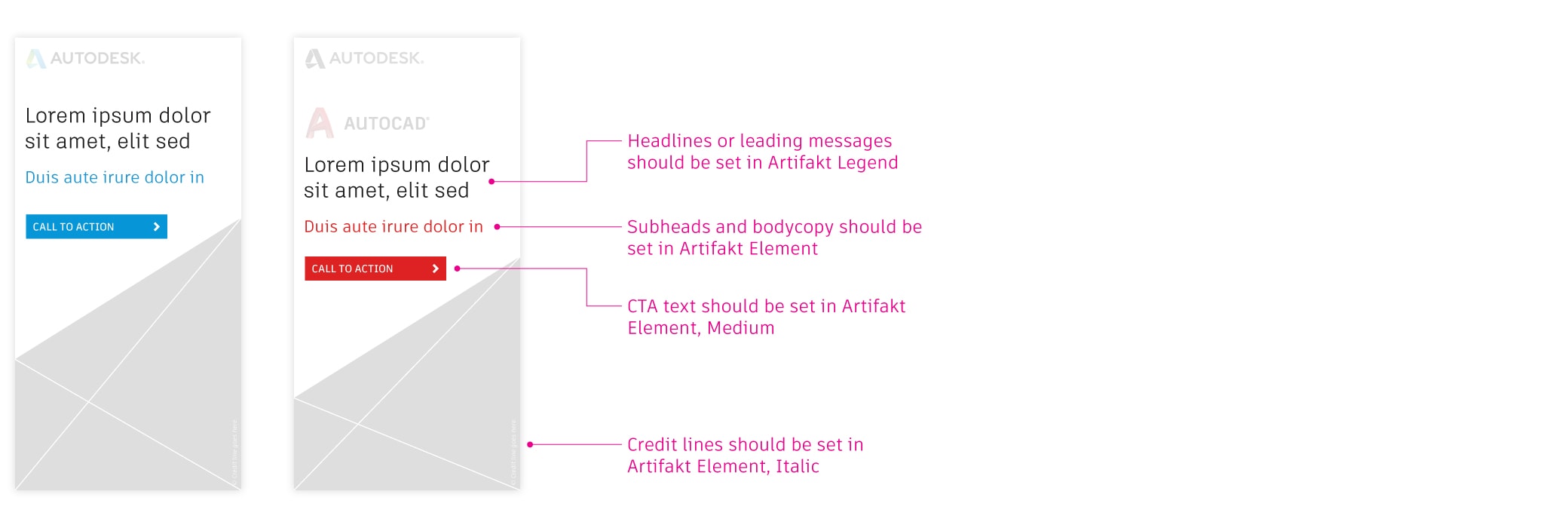
Typography
Artifakt should be the only typeface used—regardless of the type of campaign you’re creating. It comes in two collections, Legend and Element, and contains multiple weights within each collection.
For additional information on typographic specifications or to download Artifakt, visit the Typography section of the Brand Hub.
Flexible elements
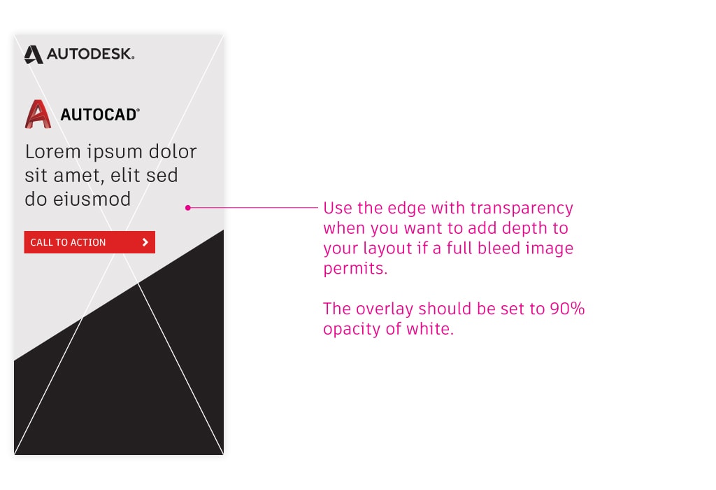
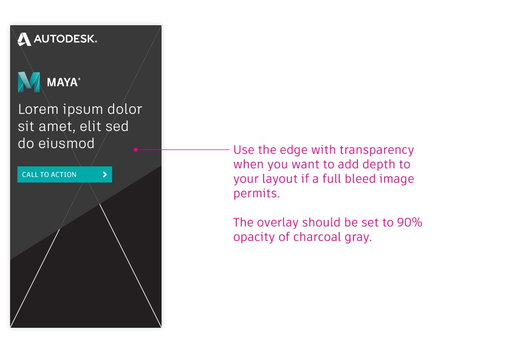
The edge
The edge refers to an angle that echoes one of the three most distinct edges of the Autodesk logo. You can utilize one of these angles in a multitude of graphical ways when creating a campaign. However, it’s most functional use is as a visual overlay to differentiate your messaging and content from imagery within your touchpoints.
As a light theme
Use a white overlay for all product-agnostic and product-specific campaigns, except for Media and Entertainment campaigns.
Opaque white overlay

Semi-transparent white overlay
As a dark theme
Our charcoal gray overlay should ONLY be used for Media and Entertainment product-specific campaigns.
Opaque charcoal gray overlay

Semi-transparent charcoal gray overlay
Messaging
Messaging is a key ingredient to a successful campaign. Make sure what you say and how you say it reflects our brand tone and voice.
Get everything you need to know about tone and voice in the Verbal identity section of the Brand Hub.
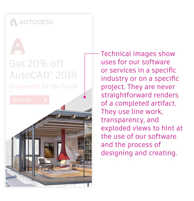
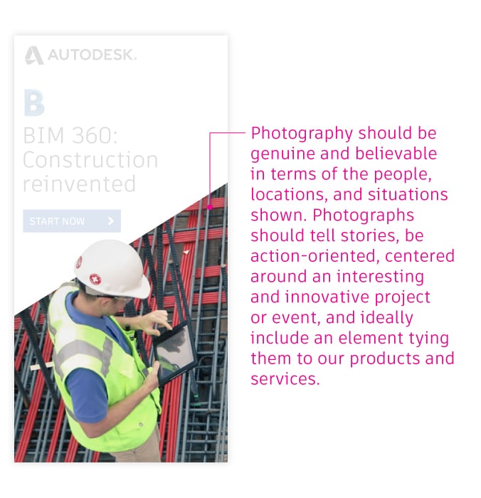
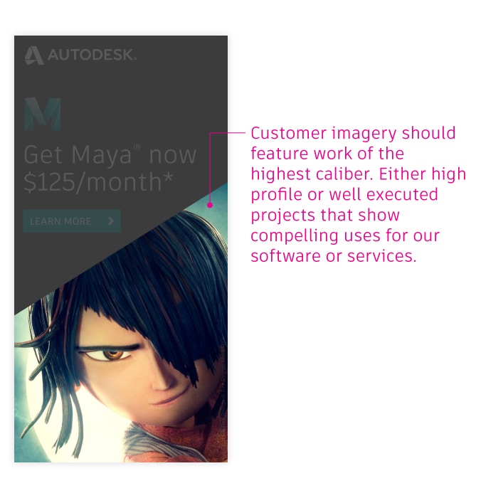
Imagery
Selecting compelling imagery for your campaign is a crucial step in attempting to capture your audience’s attention. But what type of imagery works best? Focus on impact. A strong image should reinforce a strong message, in a way that humanizes our brand and clarifies what we offer.
Technical imagery
Photography
Customer imagery
For additional information imagery, visit the Imagery section of the Brand Hub.
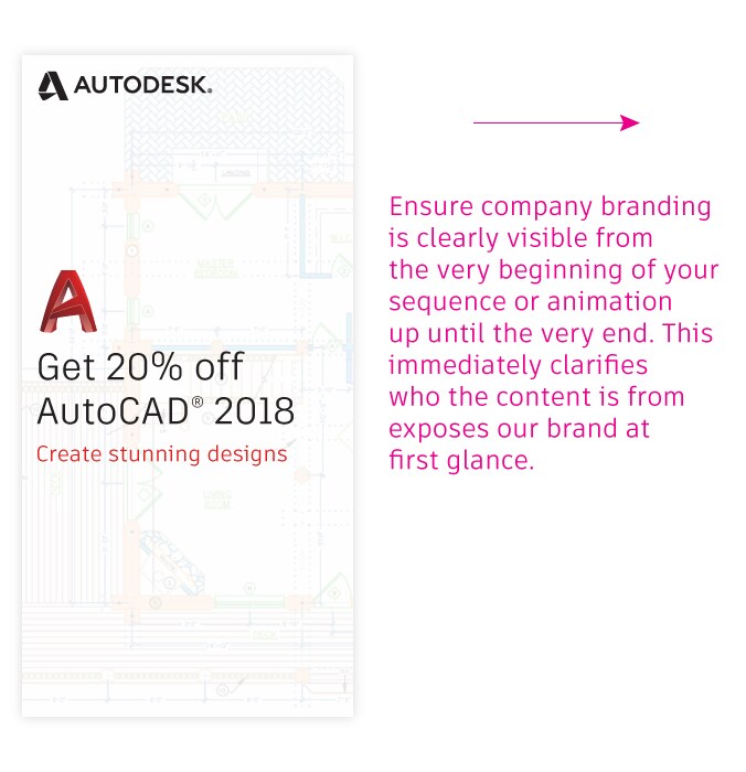
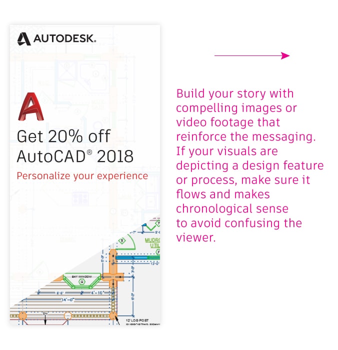
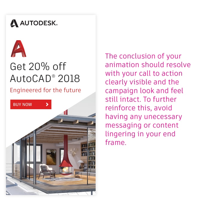
Animation
Animated web display banners have an exponentially higher click through rate compared to static banner ads. Here is some basic brand guidance when creating animated gif or html banners to tell your story.
Beginning
Middle
Ending
Examples
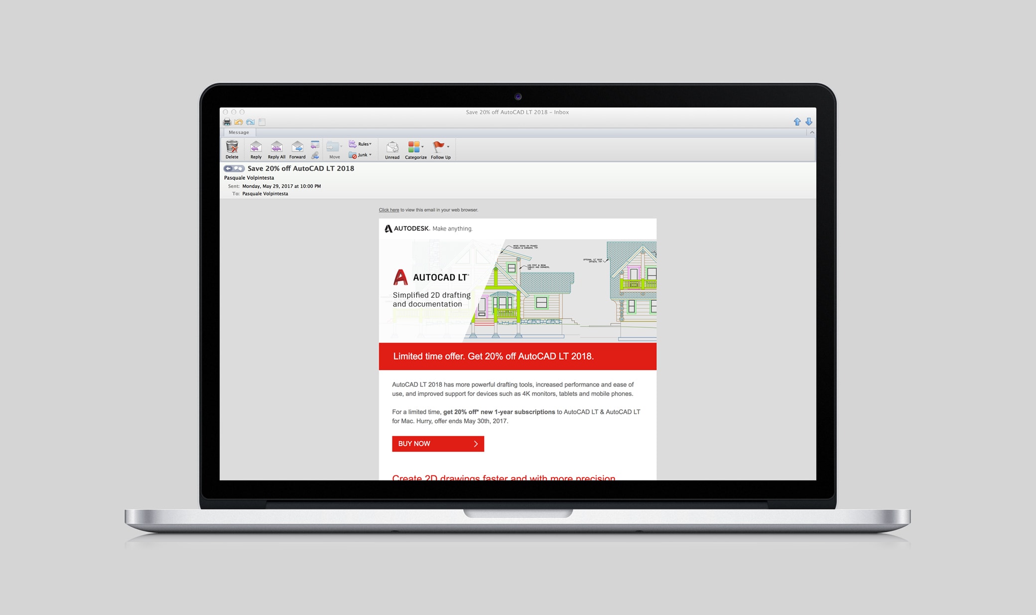
Below are a few examples demonstrating how fixed and flexible elements come together to create campaign touchpoints.
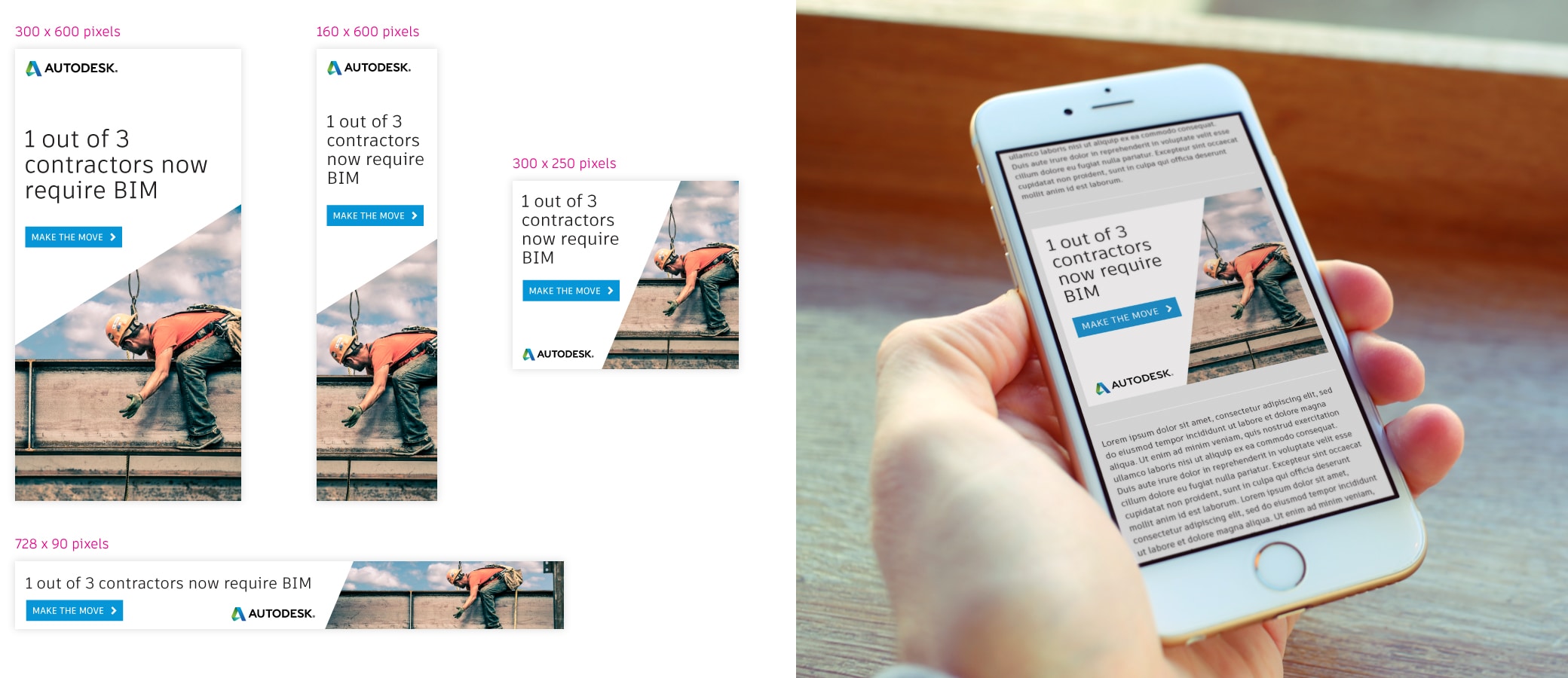
Product-agnostic web banner ads
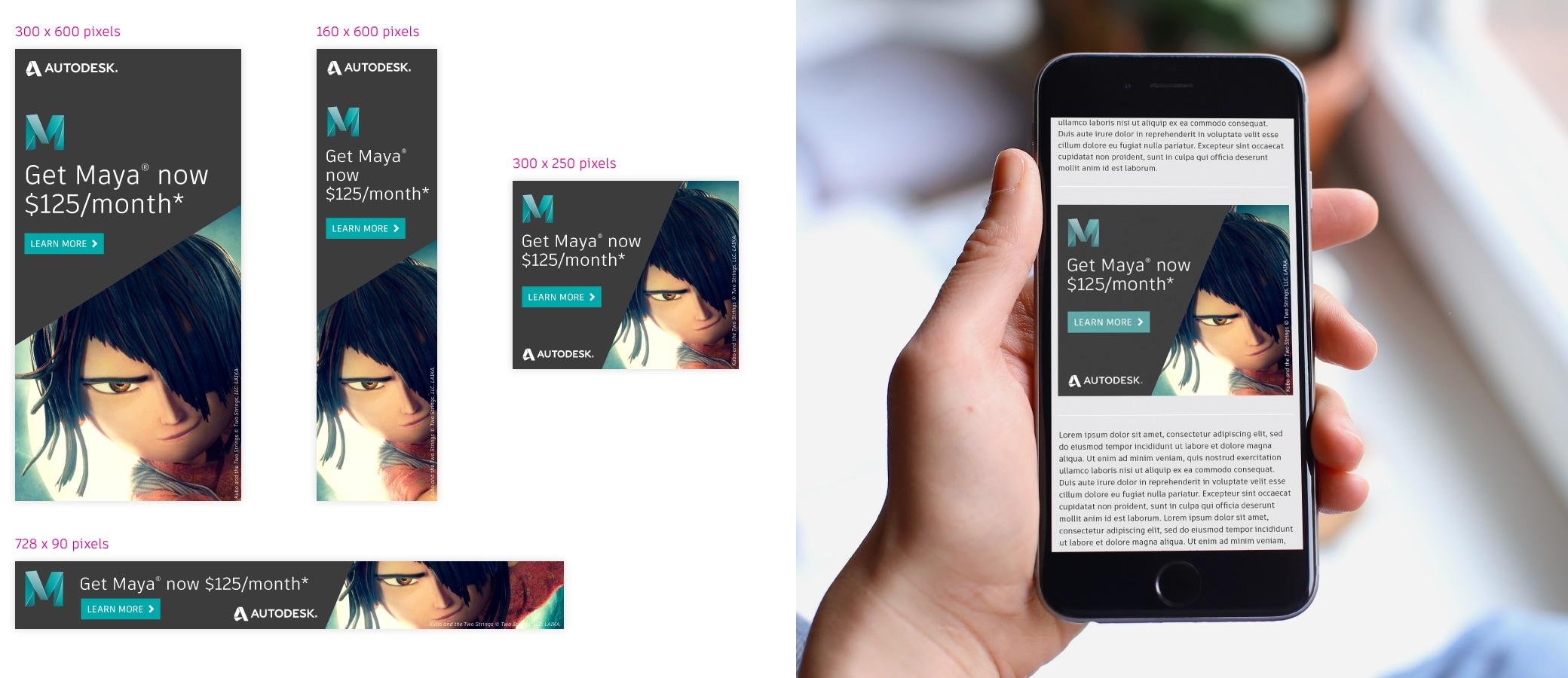
Product-specific web banner ads (light theme)
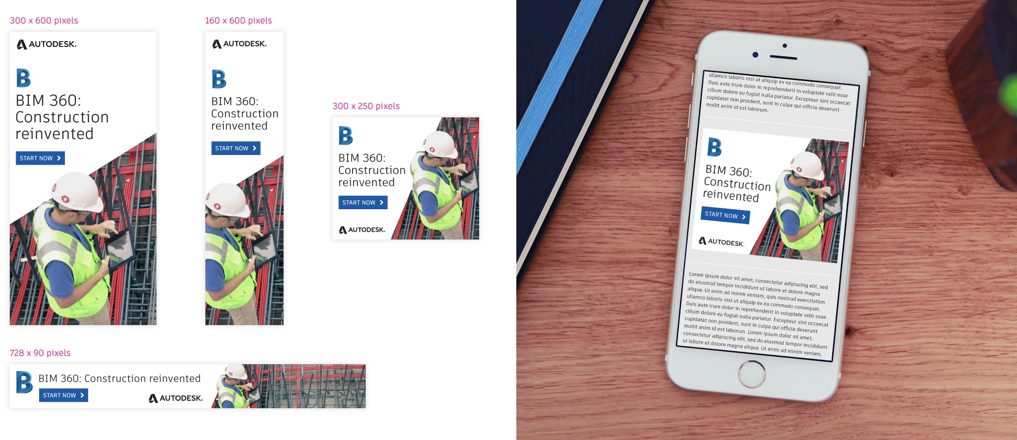
Product-specific web banner ads (dark theme)
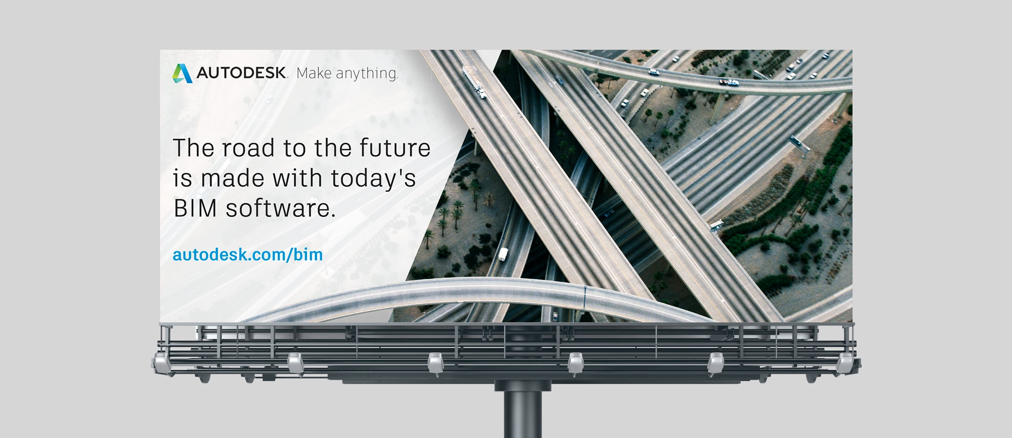
Product-agnostic outdoor ad
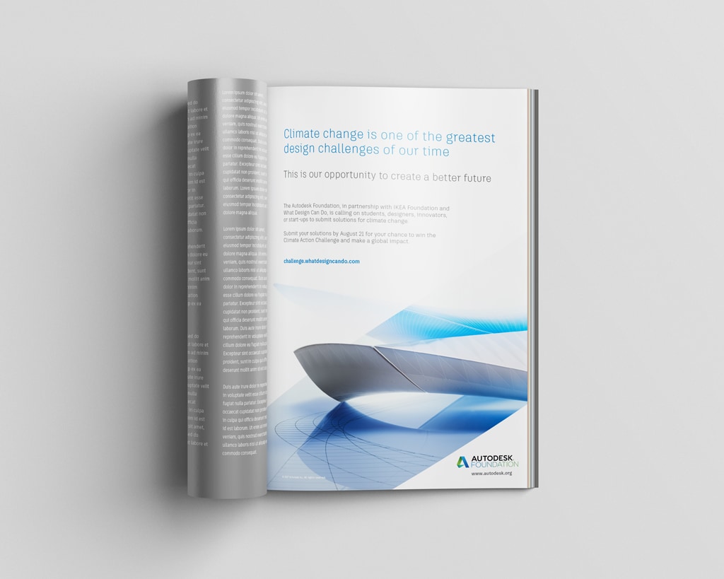
Product-agnostic print ads
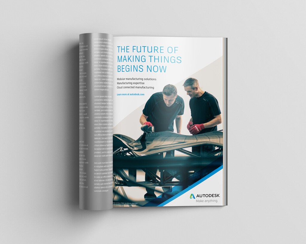
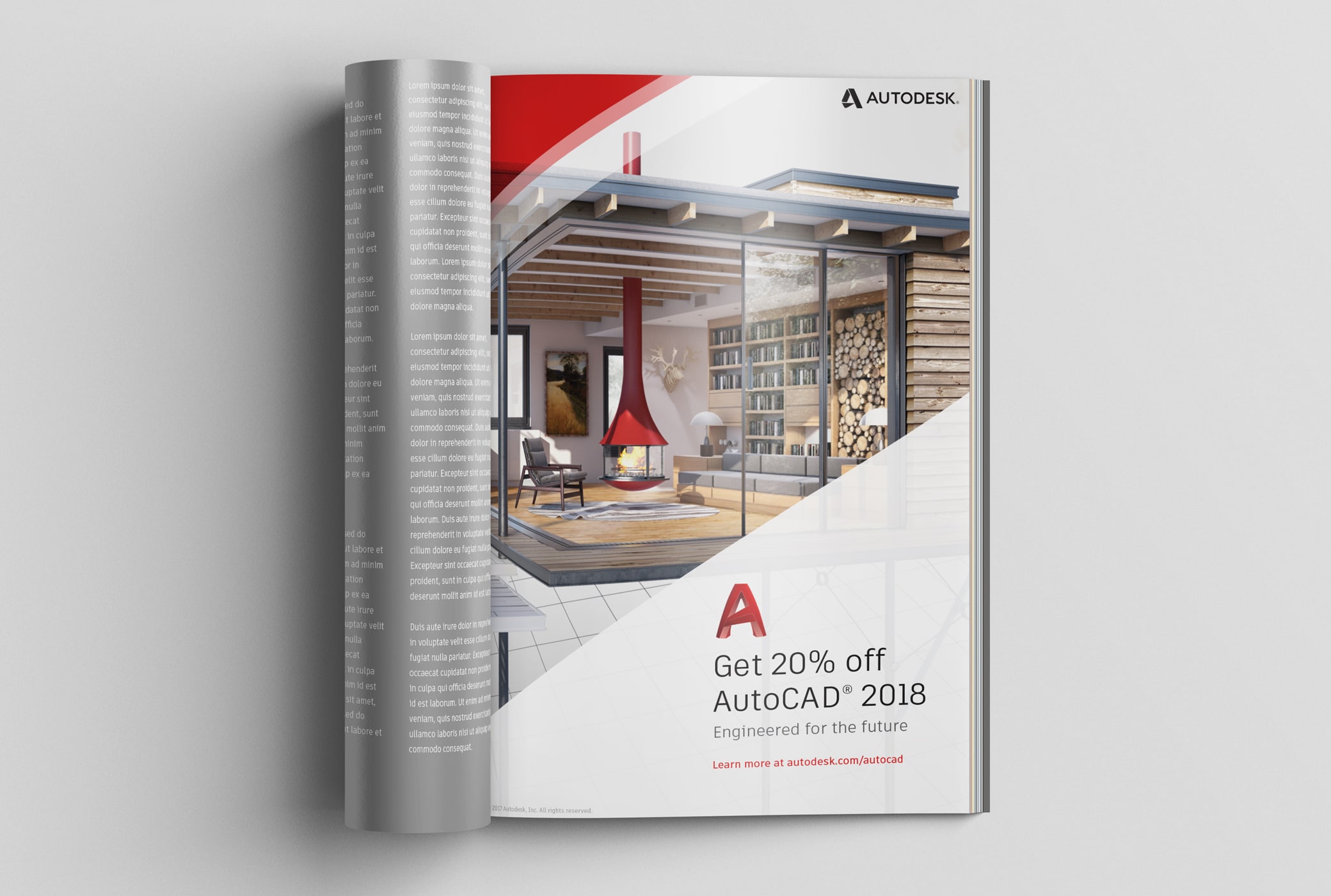
Product-specific print ad
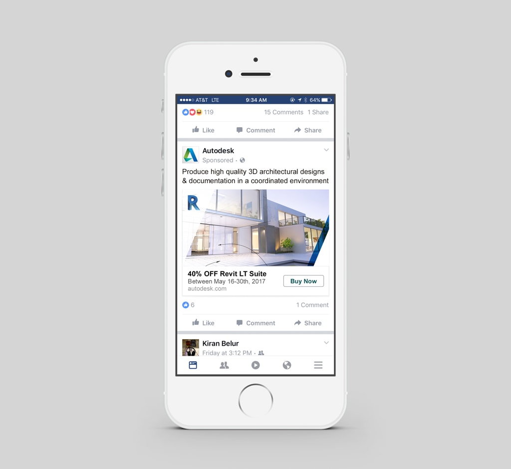
Product-specific social media post
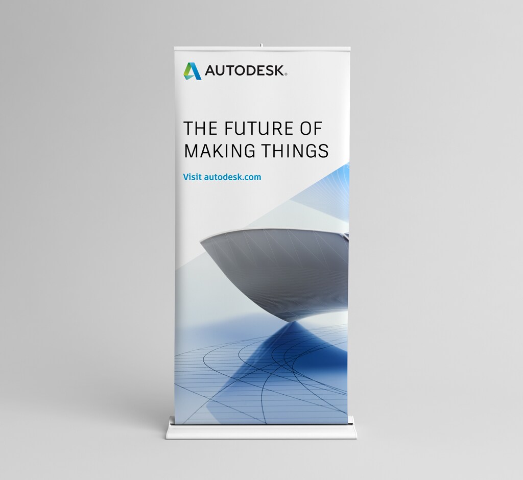
Product-agnostic event banner
Product-specific electronic direct mail