![]()
Keyboard ALT + g to toggle grid overlay
Design principles
Our guiding light
Design is about making decisions. The Autodesk Design Principles exist to guide those decisions, ensuring focus and clarity, and providing a benchmark for quality. These principles will help you embody the Autodesk brand attributes in your design, enable efficiency in execution, and establish consistency across Autodesk interactions.
Every one of our experiences should tell our story: the future of making things. The most obvious way is to use our logo and tagline: Make anything. But our story is also embodied in all our design elements that, when used consistently, say this is Autodesk.
Remember not to confuse consistency with being homogeneous. We are a global company, and as such, must make sure to use local talent to create culturally diverse, relatable content for all our audiences.
So, let’s get to it, and happy designing!
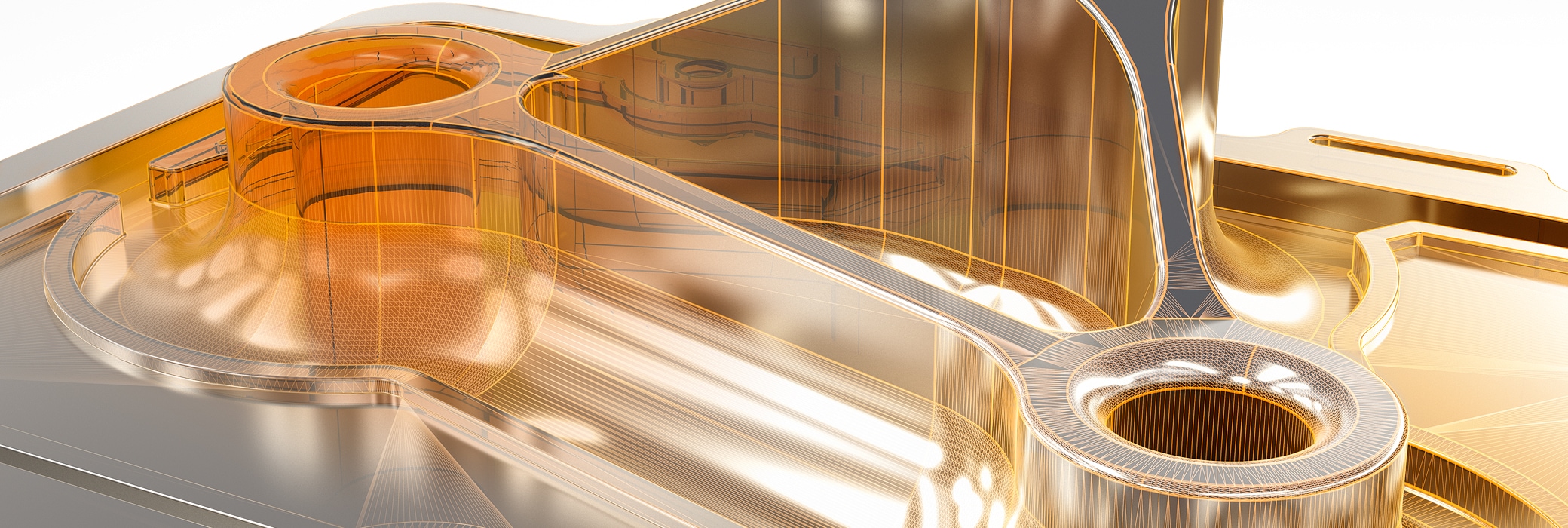
Autodesk design makes the complex beautifully clear
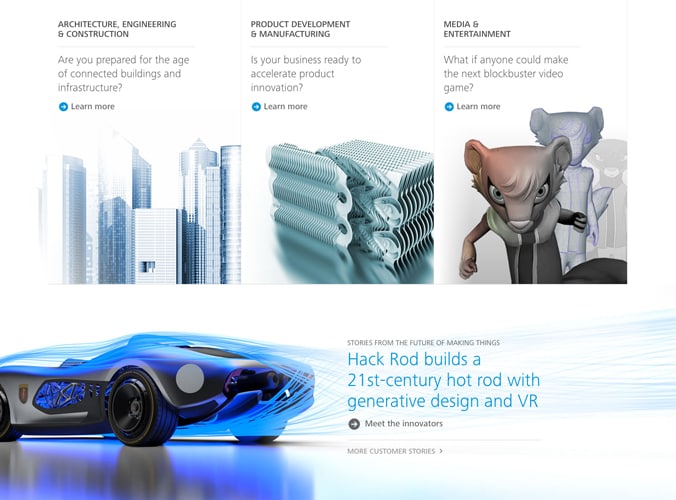
Intrigue audiences by making technical concepts accessible through inviting experiences, clear messaging, and inspiring images.

How?
Through details
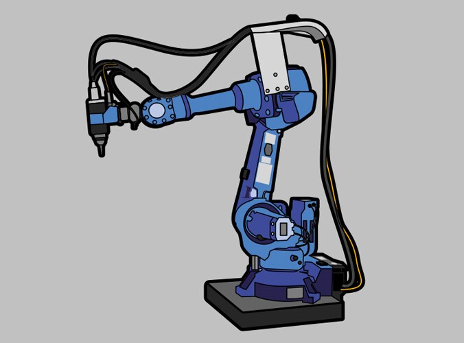
Feature imagery that reads well at a glance but is rich in detail upon closer inspection.

Through simplification and hierarchy
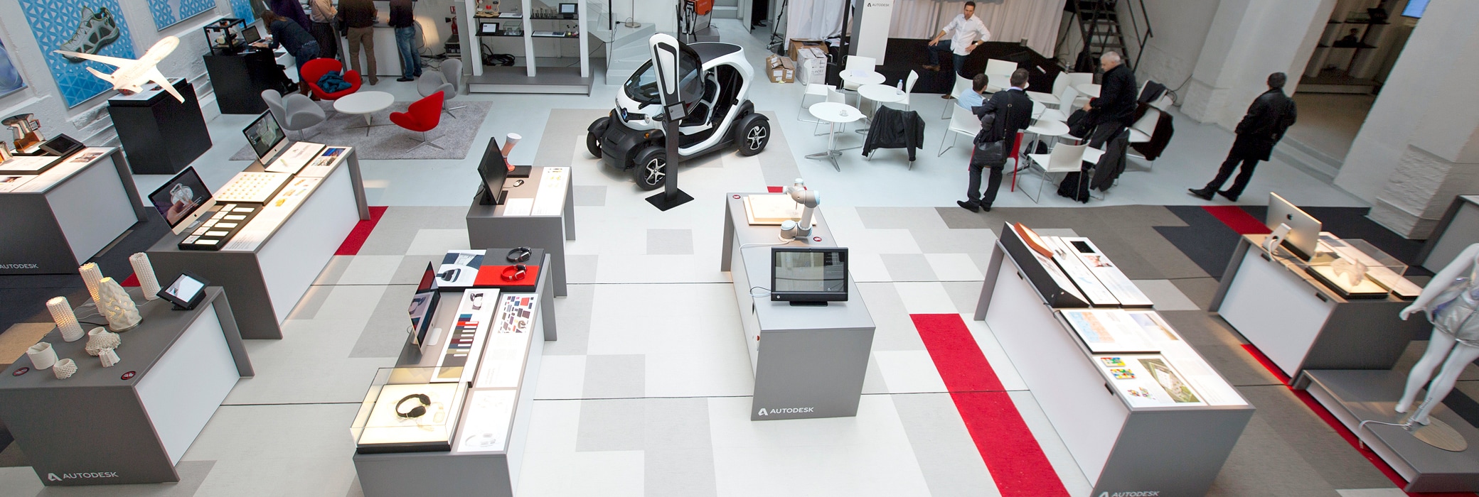
Simplify your layout to avoid overwhelming your audience with too many competing elements and make your hero content prominent. Maintain a clear visual hierarchy of information, whether on a small banner ad or in a mammoth event hall.
Through approachability
Speak like a person using language that is inclusive and conversational. Don’t lecture. Always make messaging and calls to action explicit and succinct.
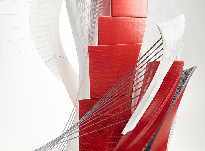
Autodesk design has depth
Our customers create in three dimensions. Autodesk is a 3D company. We always keep the z-axis in mind when we communicate.
How?
Through imagery
Use compelling 3D images—our brand’s most prominent visual differentiator—as well as layering techniques and depth of field in photography to add richness and interest.
Through rendering
Express dimension when creating illustrations, patterns, or motion graphics unless legibility is compromised. Use drop shadows judiciously when trying to communicate spatial relations in 2D.
Through structure
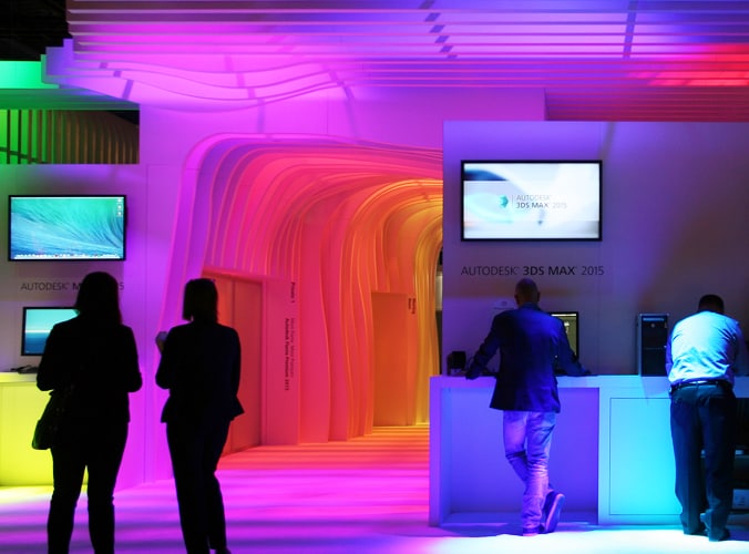
Treat spaces and environments like architectural experiences to inspire audiences.
Autodesk design embodies light
We evoke optimism through an approachable persona and a bright and open atmosphere.
How?
Through brightness
Avoid dark backgrounds whenever possible, unless otherwise appropriate to a particular design function or challenge. When unavoidable, imply lightness in other ways, such as with the inclusion of accent colors.
Through space
Use negative space and only the necessary amount of copy—with fonts weighted appropriately for their purpose—to make layouts breathe and flow. Avoid cluttered imagery. Likewise, design physical spaces and environments with fluid circulation and inviting lighting.
Through optimism
Focus on optimistic outcomes and aim to inspire with positive imagery.
Autodesk design is dynamic
We are energetic in the way we look, what we say, and how we sound. We imply movement everywhere, from spaces and imagery to video and typography.

How?

Through framing and techniques
Use motion blurs, interesting camera angles and movements, and dynamic compositions across visual touch points: buttons, imagery, etc.
Through immersion
Guide the audience through your experience with a clear hierarchy of typography and information. Create flow in physical or virtual spaces by using interactive elements to maximize the immersive effect.
Through audio-visual cues
Incorporate movement to your layout if it helps highlight a specific feature or outcome without distracting from your content. Enhance video or animated content further with sound and lively music if appropriate.