![]()
Keyboard ALT + g to toggle grid overlay
Illustration
The art of simplicity
From the smallest icon, to largest trade show graphic, illustrations are important elements in our user experiences. Wherever you use them, illustrations should simplify data and clearly explain concepts in an approachable manner.
Regardless of the subject or industry, all our illustrations should look like they come from the same company.
Unifying criteria
When creating illustrations, please adhere to some common criteria to make for a more cohesive user experience.
Keep it real
Use realistic proportions and favor natural perspective over forced or “isometric perspective.” Unless it’s absolutely essential to the message, please refrain from "cute” or “cartoonish” depictions.
“Real” doesn’t mean attempting to replace photographs in all their detail. That’s never our goal. Instead, we want to portray the details that need to be communicated in appropriate proportion with a natural perspective.
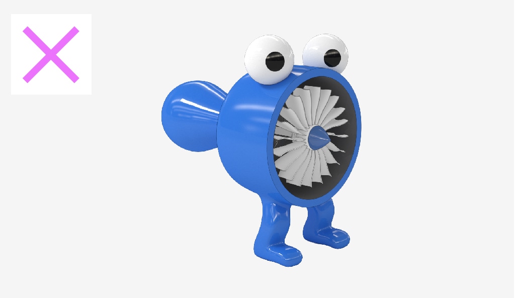
While it is true that we make software that can be used to make cartoons, cartoon characters aren’t the right fit for communicating with our customers.
Keep it simple
Details are important, but not every detail is important to every story. First, consider the most basic representation of what you are trying to communicate. Then add detail back as appropriate to adequately convey your message.
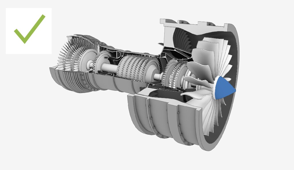
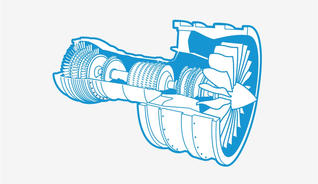
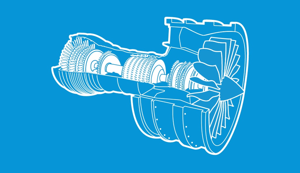
Sometimes very simple is enough. These icon-like illustrations communicate their messages with the absolute minimum of detail. Due to their simplicity and graphic nature, they are good candidates for many Autodesk illustration needs. Because they are “flat,” perspective is not a concern. Proportions in each are realistic.
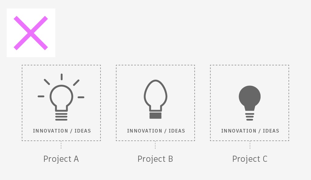
If we try to add additional details to the images on the left, they become too specific and take away from their concepts as a whole.
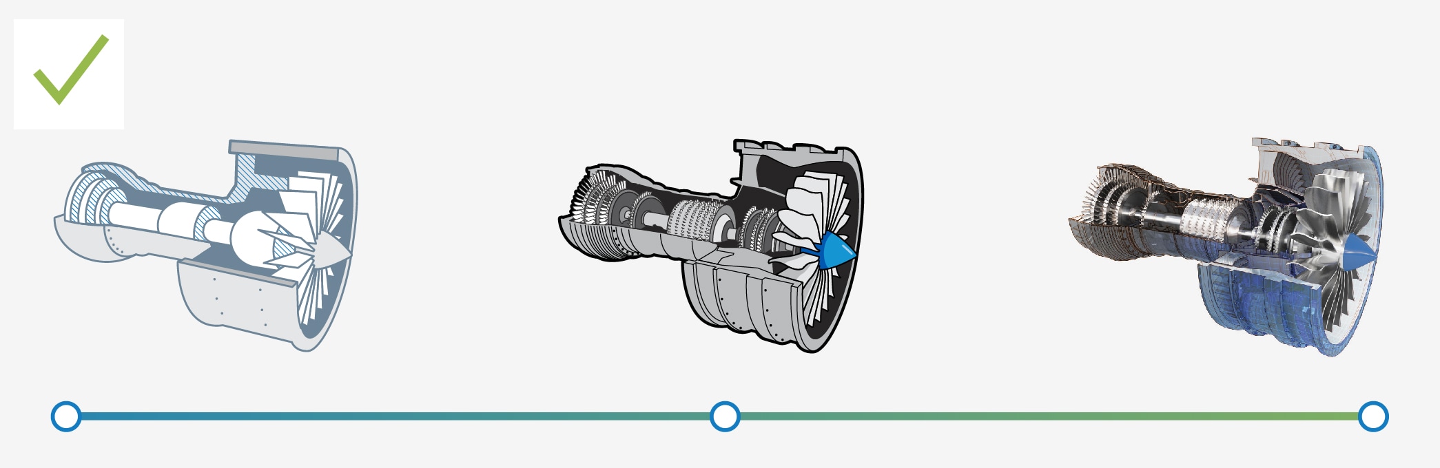
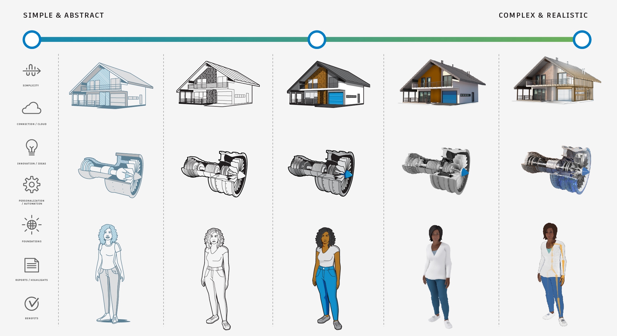
All the above representations of a turbine engine are appropriate in different contexts. Start your thought process at the left, the simplest articulation of the idea, and work your way right as the story dictates.
Keep it elegant
There is often a temptation to add “pop” or “fun” to things that are clear and working well. Unfortunately, many times these additions can hinder clarity and conflict with the simplicity and elegance of the Autodesk brand.

These are examples of clean, elegant illustrations.
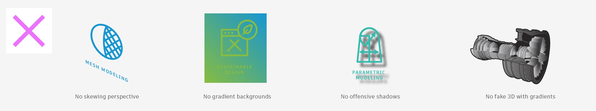
These added effects diminish the strength and integrity of the assets.
Use approved colors
Want your illustration to fit in with the pack? Use color as outlined in the Colors section of this site. For your major color choices, please look to our pre-defined primary colors, secondary colors, and tints—in that order.

These illustrations use the Autodesk primary colors.
This editorial illustration uses the Autodesk primary and secondary colors.
Reduce, reuse, and recycle
Want to save time and work on your end? Check with the Brand Team to see if something you’re attempting to communicate has already been addressed in an illustration. Consider if reusing that asset is appropriate, or think about whether the existing illustration could be modified.
Reusing approved assets helps us all communicate effectively and consistently.
You don’t need to reinvent the wheel every time you need to communicate a concept via illustration. Not only is it resource-intensive, it counters our desire for consistency.
Some starting points
We have a broad range of illustration needs that cover many uses and scales. Below you will find basic approaches, from simple to more complex, to consider when illustrating information.
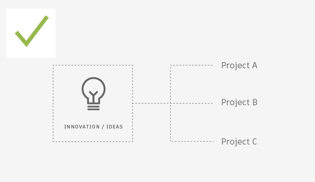
Icons
Quite often you’ll want to drill down to the very essence of a concept. If such an illustration doesn’t exist in our DAM Icon library and a custom illustration needs to be developed, it should family with the rest in our collection. These simple conceptual illustrations are characterized by a single color and unified line weights.
Graphic spot illustrations
This style of illustration is great for representing objects that need to be seen and understood at a glance and at medium-to-small scale. They can be executed in either 2D with vector-based tools or in 3D using non-photorealistic rendering techniques. When using graphic spot illustrations, please refrain from trying to convey materials in a photorealistic way.

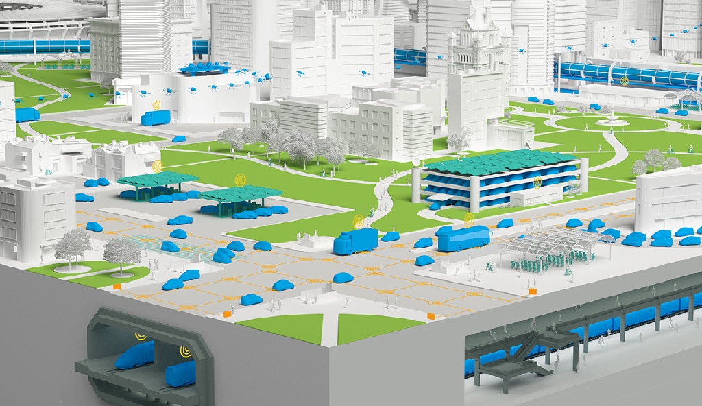
Non-photorealistic 3D rendered illustrations
If you work with 3D, you have a great deal of flexibility in composing and rendering illustrations to best tell your story. Using 3D, it is possible to achieve final results that range from the graphic examples above to ones that are highly photorealistic. As always, the story should dictate the degree of complexity and visual style.
In general, non-photorealistic illustrations work well for clarifying important points, as they can call attention to details without competing with reality. Sometimes it is effective to mix photorealistic and non-photorealistic elements for emphasis. In general, unless the story is about how realistically something can be rendered, try not to be 100% photorealistic.
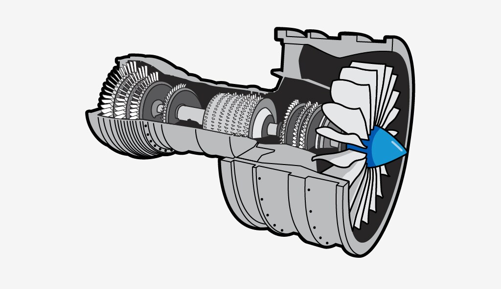
Here, solid Autodesk brand colors have been multiplied over an ambient occlusion pass and line work has been added on top for a non-photorealistic illustration that is easy to understand.
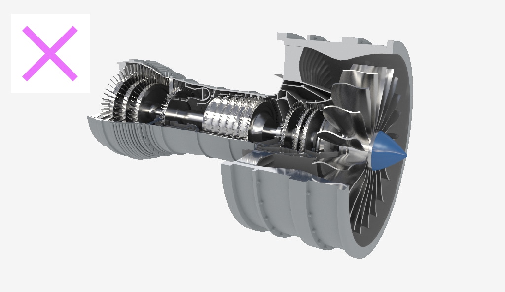
In this image, the subject looks more like a photo than an illustration. When comparing this image to the one on the left, the added materials and shading make it harder to understand where the emphasis is supposed to be.
Technical 3D illustrations
Sometimes you need illustrations that show the beauty of something real or imagined, while simultaneously revealing that our software played a role its inception. These images are often developed to stand on their own and be viewed at large scale. They invite viewers to come in close for more details, rather than move on after a quick peek.
For these situations, we have developed a style that involves rendering the same data with different techniques and materials, and then blending the results together to support the story we need to tell. The end result should be a blend of inspiration and information.
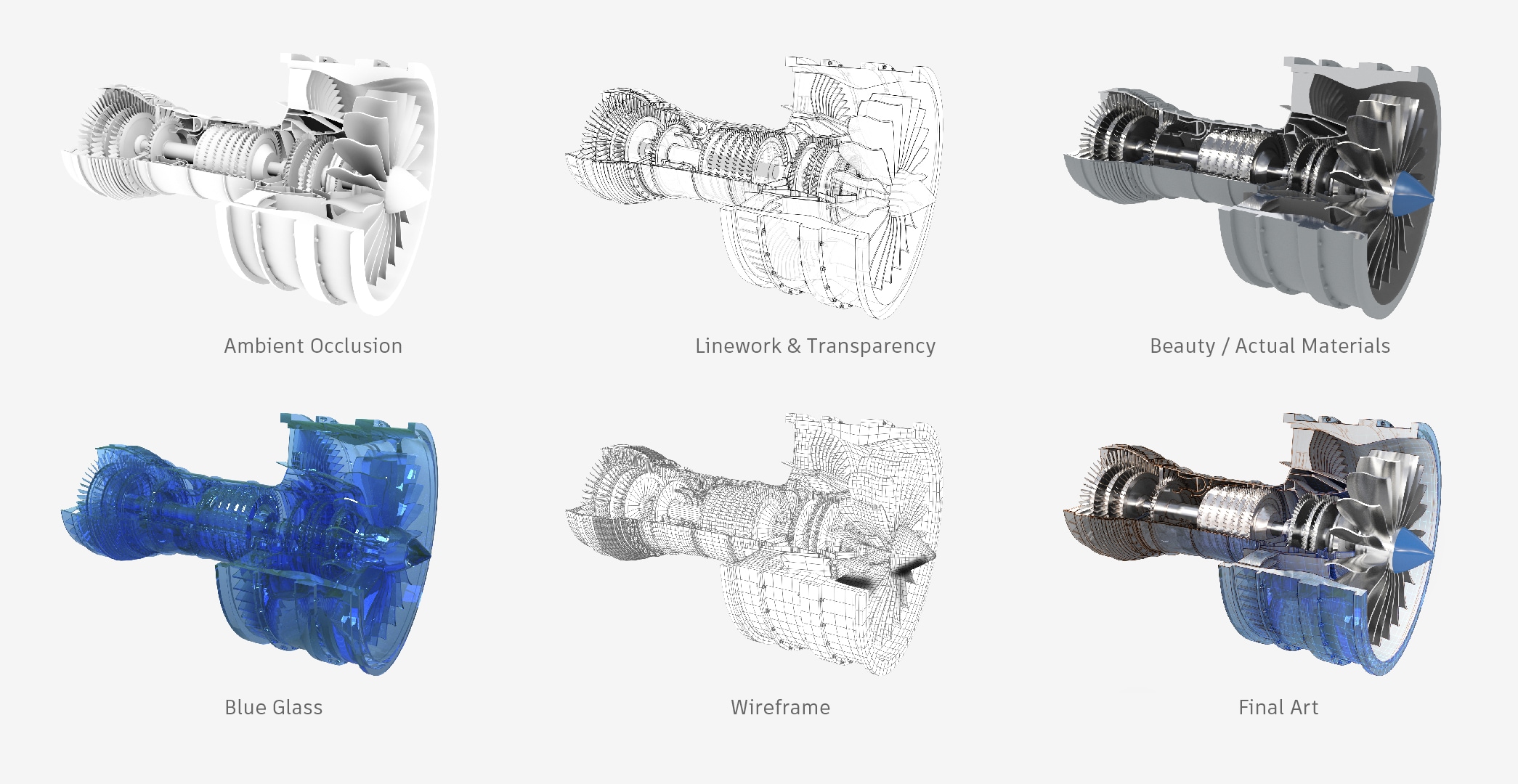
In the image above, the five images on the right were all selectively blended to create the image on the right. Rather than just presenting a straightforward depiction of a finished product, this image suggests the design that went into it, and the role that Autodesk software played.